
We are in an era of dark mode. Some people who prefer dark mode are of the opinion that using dark mode helps the eyes by exposing it to less light, to some, dark mode is used due to it's known ability to save a lot of power on AMOLED screens while to others, it's purely for aesthetic reason. Currently, popular applications and operating systems give users the option to enable light or dark mode. This is an accessibility win.
The web platform is not left out. Media Queries Level 5 introduced user preference media features. This enables websites to detect the user's preferred settings to view content on the web.
In this article, I'll be discussing the prefers-color-scheme media query.
The prefers-color-scheme media feature is used by the browser to detect the color theme (light or dark color theme) set by the user and use the setting when rendering the page. This media feature works with no-preference, light or dark as its value. For example, if the prefers-color-scheme: dark media query value is set to true, it means that the user has set their operating system to dark mode and prefers UIs with a dark theme (light text on dark background).
<p class="color-scheme">
  This color changes based on the user's operating system's settings.
</p>
:root {
--light-theme-background-color: #15202b;
--light-theme-text-color: #fafafa;
--dark-theme-background-color: #fafafa;
--dark-theme-text-color: #15202b;
}
.color-scheme {
background-color: var(--light-theme-background-color);
color: var(--light-theme-text-color);
}
@media (prefers-color-scheme: dark) {
.color-scheme {
background-color: var(--dark-theme-background-color);
color: var(--dark-theme-text-color);
}
}You can view the support for prefers-color-scheme on Caniuse.com
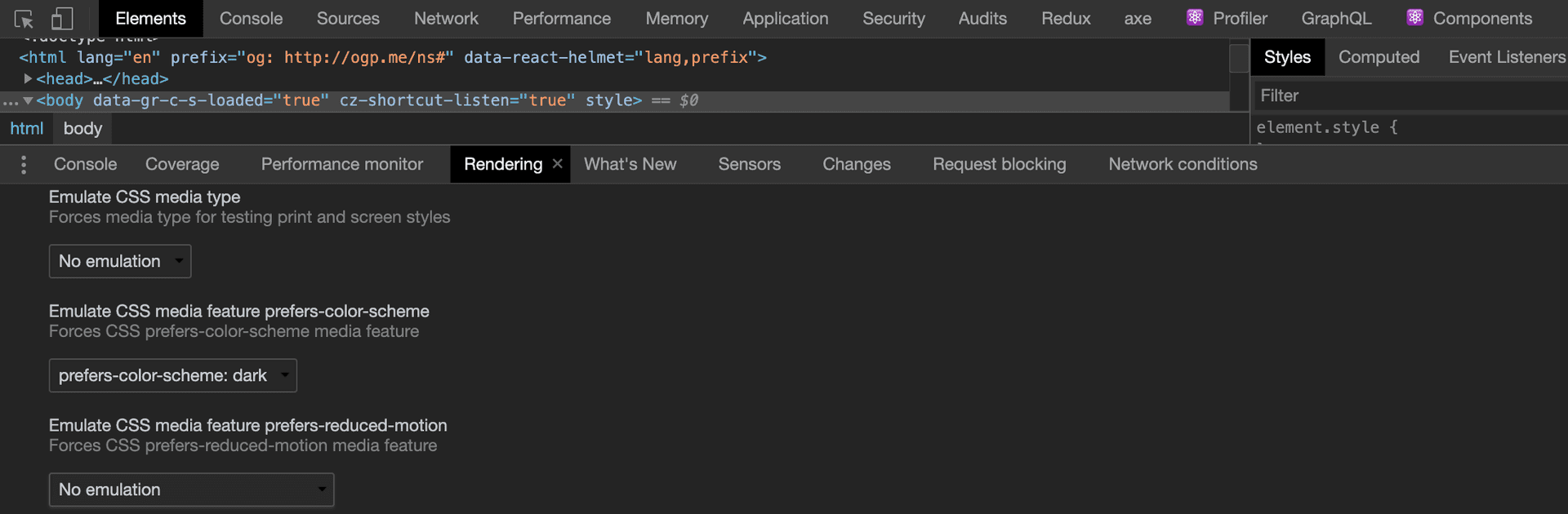
For websites with prefers-color-scheme implementation, you can emulate the appearance on different color modes without switching the operating system's color scheme. This is possible using Chrome DevTools. This is done in a way that only the visible tab is affected. When you switch to a different tab, you would need to choose the color scheme you need to emulate.
To achieve this,
- Press CTRL + SHIFT + I in Windows and Linux environments or CMD + OPT + J in a Mac environment to access the DevTools
- Open the Command Menu using CTRL + SHIFT + P or CMD + SHIFT + P
- Type Rendering and run the Show Rendering command,
- Change the Emulate CSS media feature prefers-color-scheme to your preferred option.
For certain websites, images on a white background appear too obvious when a dark theme is activated. To tone down these images, you can choose to re-colorize or invert the colors.
/* re-colorize images */
img:not([src*='.svg']) {
  filter: grayscale(50%);
}

/* invert images */
@media (prefers-color-scheme: dark) {
  img:not([src*='.svg']) {
    filter: invert(85%);
  }
}
To avoid bloated stylesheets, you can create different stylesheets to handle theme-related styles. These can then be loaded conditionally.
<link
  rel="stylesheet"
  href="style/dark.css"
  media="(prefers-color-scheme: dark)"
/>

<link
  rel="stylesheet"
  href="style/light.css"
  media="(prefers-color-scheme: light)"
/>

<link rel="stylesheet" href="style/style.css" />
Conclusion
Supporting dark mode can make a great difference for users visiting your website as it can make or mar the user experience.